I crafted the vision, conducted research, developed the strategy, defined our roadmap, and designed the Trading product end-to-end.
In this case study, I focus on how I optimized a high touchpoint page and added value through feature enhancements.
Trade Order Details Enhancements

TIMELINE5 months
TEAMLead designer (me), engineering team, 2 product managers, 2 product strategists
ABOUT RIDGELINERidgeline is an enterprise investment management software company. Our customers are boutique investment management firms that deal with institutional portfolios and high net worth clients. Ridgeline seeks to address the needs of every role within these firms through a modern, cloud-based system. Our Trading platform allow firms to track the lifecycle of their trades and streamline investments across their portfolios. Firms can manage orders, portfolio allocations, and executions across asset classes from one single platform.
As the lead designer for the Trading and Portfolio Management team—I oversaw and crafted the user experience of our workflows and visuals. My role also includes conceptualizing new interactions and components for our design system library as well as working cross-functionally with other product teams. Collaborating with engineers, PMs, strategists, and other designers are large parts of my daily work at Ridgeline.
This case study covers how I added product value through iterative UI enhancements and user feedback.
PROBLEMWhat are feasible yet high impact strategies we can employ to our order details page so it’s more valuable and efficient for our users?
Business goalsDefine both long-term strategy and short-term tactics to improve UX
Deliver a modern interface that pushes the industry standard
GOALSUser goalsFind high-level order information easily, optimize time
Users (Traders and Portfolio Managers) workflows are sped up with a purpose-built system and users can act on complex data at scale
Design goalsEstablish design culture of designing purposefully for user-established pain points
Improve existing design system components
Ridgeline’s customers: boutique investment management firms that deal with the portfolios of institutions & high-net worth individuals
Ridgeline Trading users: Traders and Portfolio Managers (only a few at each firm)
CUSTOMERS + USERS
Measuring SuccessUser satisfaction & happiness
Direct reflection of our attention to detail & ability to listen to our user
“Customer Satisfaction” is one of Ridgeline’s core values
Qualitative metric measured through direct user feedback
MEASURING SUCCESS + CONSTRAINTSConstraintsEarlier on, we only had one firm signed on for Ridgeline
Focused on building a MVP
Ensure new proposed components could be extensible to other product areas
Application isn’t live with our customers yet, so no analytics to measure
TRADING WORKFLOWTrade Order Details page
For context setting, firms can perform these actions on the trade order details page:
track the lifecycle of a trade
manage portfolio allocations
view trade history
edit order details
handle all incoming Places & Executions
COMPETITOR SYSTEMSCurrent competitor systems are outdated, cluttered, and notorious for having terrible UX. They are clunky, noisy, and resemble polluted Excel spreadsheets. There’s a steep learning curve for these systems as well, which only benefits the experienced power users.
You ask power users of these systems on their opinion of the UI and they will respond, “that’s how it’s always been.” An industry standard shouldn’t have to equal subpar user experience.
Examples of competitor systems:
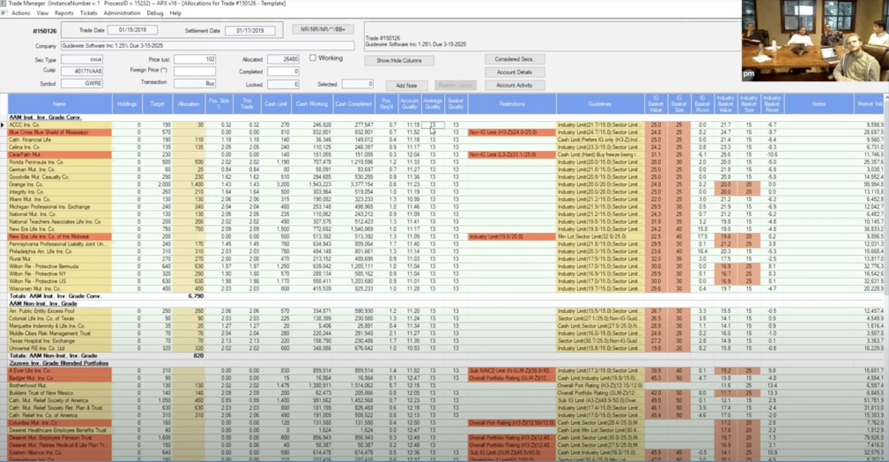
APX
⤴ click image to expand
Advent Moxy
⤴ click image to expand
Bloomberg AIM
⤴ click image to expand
Charles River
⤴ click image to expand
SS&C Eze Eclipse
USER RESEARCHUser: Associate Portfolio Manager and Trader @ Zazove Associates
Pain PointsToo much wasted “white space”
Dislike not being able to hide irrelevant order details when desired
Hunting for portfolios & allocations grid instead of immediately seeing it
Can’t understand order details at first glance
Other user insights“When I come to this page, I need to quickly understand what’s going on in the order… what security I’m trying to trade, what the status of my order is, where the allocation grid is…”
Almost always work on wide monitors, utilizing horizontal real estate is key
UI ANALYSIS: USERUser: Associate Portfolio Manager @ Zazove Associates
We asked our user to analyze our current trade order details page and write down their reactions, pain points, thoughts, etc.
UI ANALYSIS:
DESIGNER (ME)
After asking our user to do a UI analysis of the trade order details page, I also did a designer analysis.
IDEATIONAfter running the UI analysis with users, I ran a FigJam exercise asking the designers on our team what we thought were the largest areas of opportunity. These were the steps:
Group similar ideas across the board together
Label each category as either “short-term” or a “long-term” design & engineering effort
Vote on viable (short-term) categories!

Page Header and Collapsed Cards were the two key high-impact, viable categories that held the most design opportunities.
REDESIGN: PAGE HEADERHow might we redesign the page header to be more useful for our users?
The ProblemCurrently there’s repetitive information [highlighted in pink below] in our page header. The Order ID # is irrelevant to our Traders, and the actual information they need to see about the order is hidden within the page itself.

ResearchI conducted research on what the industry standard and practice was for trade order details. I discovered there was an industry theme of using blue / red for [BUY] / [SELL], which made it easy for users to quickly scan their trading blotter table and quickly distinguish orders apart.
IterationsCell and badge explorations of applying industry [BUY] / [SELL] color styles to our trading blotter.

SOLUTIONS1. New color palette and high-contrast app-wide badges for [BUY] [SELL]

2. Add order quantity & instrument ID onto page header. Paired with the ‘Side’ badge, it fluidly reads L -> R as an statement. Example: “BUY 1,000 [shares of] GWRE”. Previously, the page header simply said “Trade Order 123”.
3. Add KPIs, updated existing KPI styling to match our existing field label-value pairs, and pared down padding of existing KPIs from 24px -> 16px
4. Add relevant Security description details into the page title. Previously, the Security details were hidden within the order details page and the page title simply said “Trade Order Details”.

REDESIGN: COLLAPSED CARDA pain point from our users was not being able to hide irrelevant order details. This component redesign allows users to collapse irrelevant order details and saves precious real estate on the page for the allocation grid.
Redesigned card to collapse into a row that still showed high-level information
Component SpecificationBelow is part of the component spec I created for our design system and for engineers. It outlines all edge cases of the component, a breakdown of the anatomy, and various states of the component.
Before vs. AfterREDESIGN:RESTYLING COMPONENTS FOR DENSITYData density is imperative for our users and “too much white space” was a key piece of feedback we heard over and over again from our users. I revisited our components and redesigned high-touch components to be as data dense as possible.
RESTYLING CARDS FOR DENSITYRESTYLING APP HEADERS FOR DENSITYLONG-TERM VISIONTransition away from card-based layouts
Places & Executions live alongside Order Details
Allow for high-volume allocation grids
Clear real estate delineation between order information & allocation grid
Designs optimized for wide monitors
Configurable workspace
Shortkey navigation
Higher emphasis on allocation grid with collapsed content areas
Design vision of Trading at Ridgeline
Design vision of Trading (with collapsed cards) at Ridgeline
OUTCOMEOptimized a key page of a user workflow and added value through feature enhancements
Direct user feedback to measure user satisfaction:
“These are completely new and fresh to the industry. Attention to detail like this [order details] is what makes Ridgeline’s customer service stand out to us.” - Portfolio Manager at Navellier & Associates